Designer Maker User
The space also features a crowd-sourced wall of selected designs submitted by visitors and Design Museum fans through social media, which aims to break down boundaries between designer and consumer. The wall alternates products frequently, as more people submit their ideas. Product exhibits include objects such as the London 2012 Olympic Torch, the Walkman, iPhone models and Valentine typewriters. It also includes a look at London’s transport systems and accompanying wayfinding systems, and aims to include more abstract design concepts which challenge the idea of what design is.
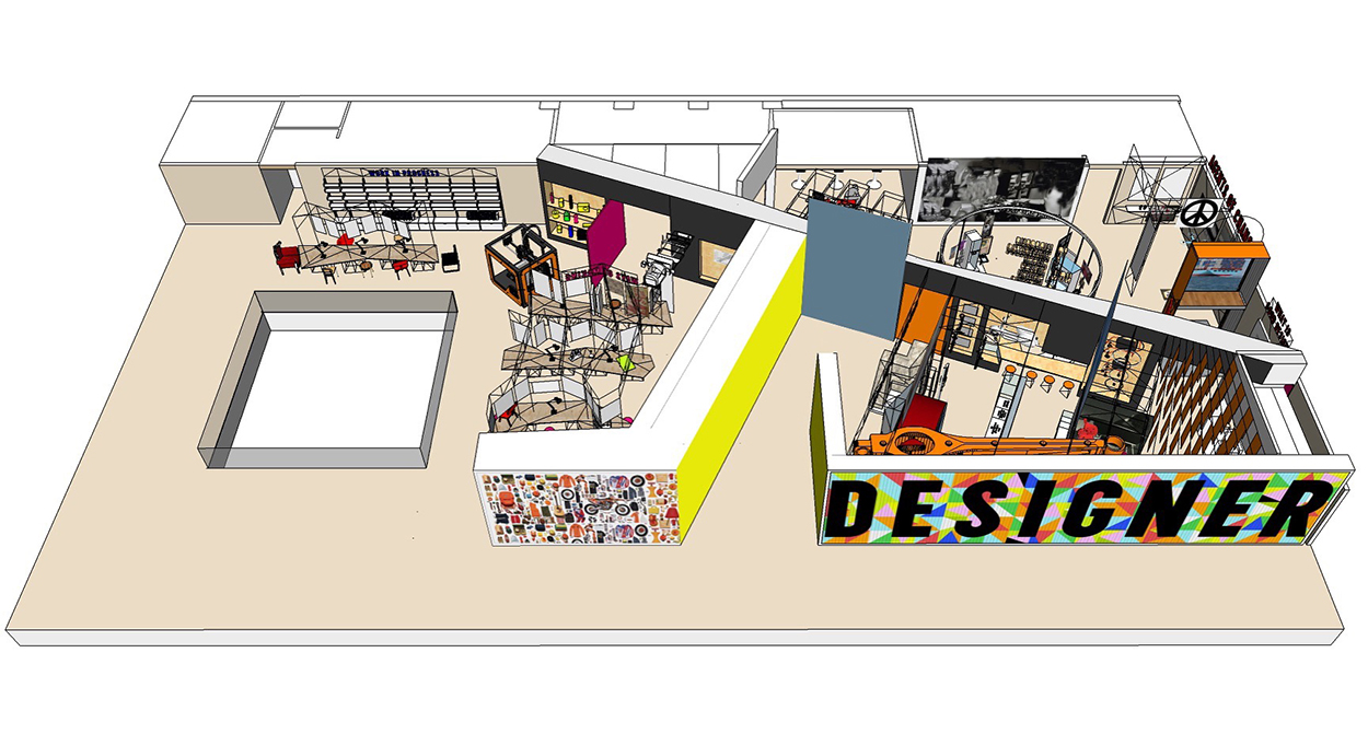
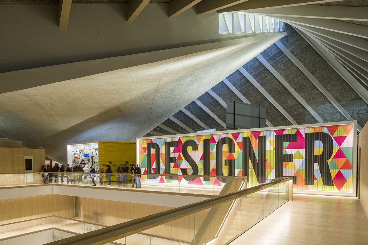
"Rather than being split into sectors such as graphics, furniture and product design, the exhibition is divided into three sections – Designer, User and Maker. The space has not been split into very distinctive or separate sections, but is 'layered', says Morag, so that visitors can see through into other spaces and exhibits wherever they stand."
"Designers need makers or manufacturers, and equally need to respond to users," Morag says. "There’s not a single, linear approach, it’s layered. Everybody needs each other, and one doesn’t happen without the other. The spaces make connections with each other – you can look at a computer, then there’ll be another thing behind it, and another thing behind that," she says. "But you can also look at each thing in isolation."
The Designer segment looks at the thought processes of the designer, while Maker looks at the evolution of manufacturing products and User explores the interaction between consumers and the designs they experience in everyday life.
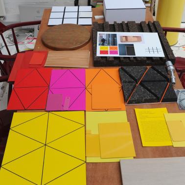
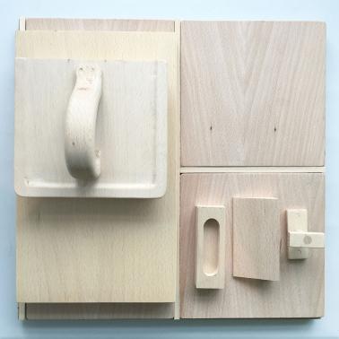
Materials have been used to reflect the different sections of the exhibition – for example, repurposed school laboratory wooden worktops have been used for the Maker section, which Morag says she "hopes will wear over time to show the evolution and changing nature of the exhibition."
"Permanent exhibitions always imply there’s an end to them and that it stops," says Morag. "This is totally open-ended. It’s about questioning things as a visitor."
Both Morag and Alex hope the exhibition will encourage visitors who are not professional designers to think about design in new ways.
"We want people to go away and think afresh about the things they’ve seen, see designs on the high street on their way home, and understand more about how it’s created and how it affects them," says Alex.
"What I particularly love is people telling each other stories when they visit," says Morag. "Like parents telling kids about when they had a particular camera. I would like it if people came, then felt they needed to return to get something else out of it. It’s a continuous investigation."
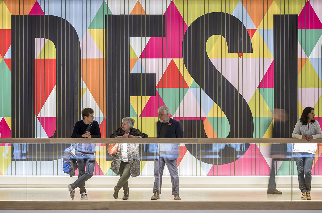
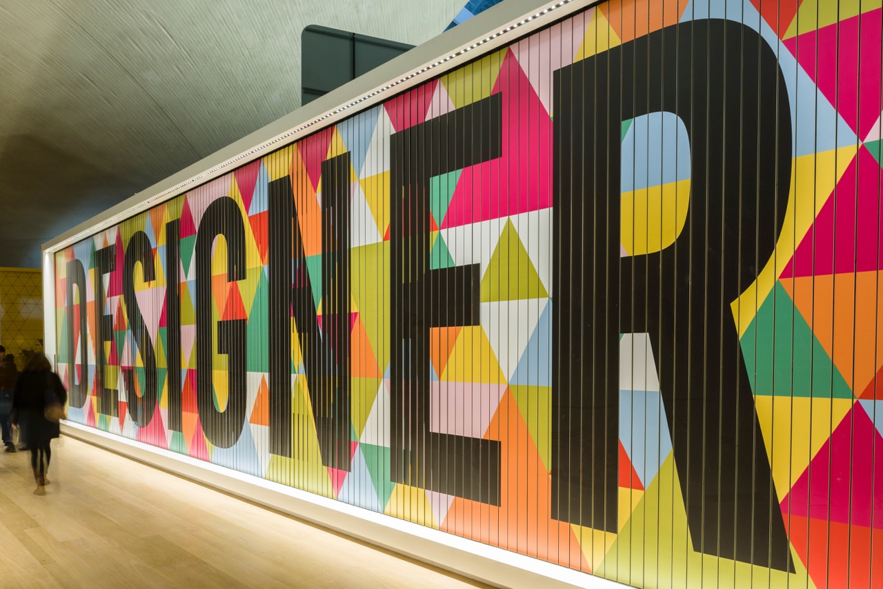
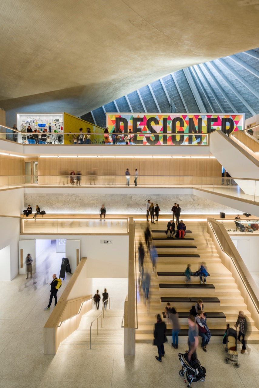
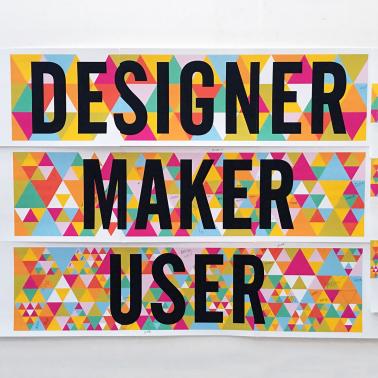
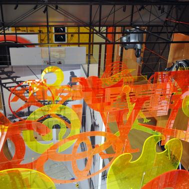
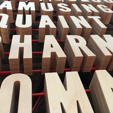
Morag has also created a moving, colourful graphic that sits outside the exhibition space, which uses a mechanical billboard mechanism to alternate between the words ‘Designer’, ‘Maker’ and ‘User’.
"We looked at digital walls but the rhythm of the mechanical wall is much nicer," she says.“We also wanted to do something that you could see from the ground floor. The exhibition sits at the top, and we wanted to draw people up there.”
"As a person, you could connect as a designer, maker or user," she adds. "This way, people could choose who they want to be."
Commissioners
Design Museum
Deyan Sudjic &
Alice Black
and
Heritage Lottery Fund
Curator
Alex Newson,
Design Museum
Location
High Street Kensington
London
Designers
Morag Myerscough
Luke Morgan
Rob Berry
Structural Engineers
Milk
Photographer
making & kitchen
Morag Myerscough
Photographer
complete
Gareth Gardner
Permanent Installation
Completion November 2016
Free entry
Read More
